Motion
Transition
Transitions are a great way to provide people with comfortable focus to a certain element. Whether it is by entering the view or by changing screens, transitions also allow to have a better understanding of the information structure as long as they are purposeful.
Attention
To trigger focus to a particular point, you can use attention-seeking animations. A great use case for such motion is whenever a person completes an action within your interface, such as saving a setting, or failing a form completion.
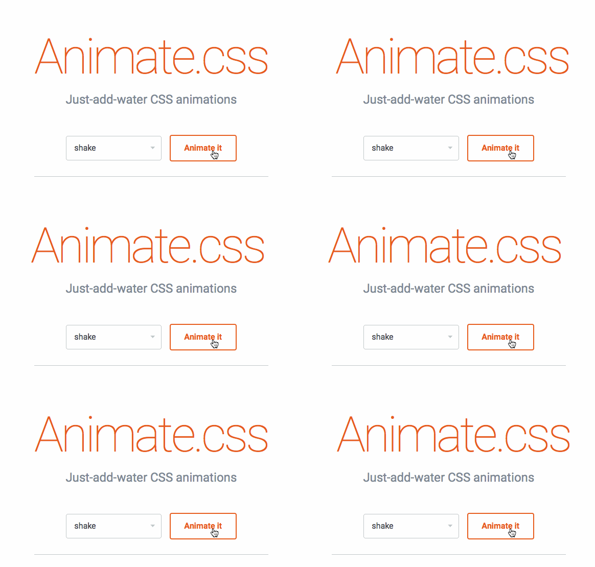
These attention-seekers should have a sparse use, otherwise they can potentially become distracting and annoying, and moreover loose their intended effect. Daniel Eden published Animate.css, a CSS framework featuring a set of pre-configured animations, including attention-seekers.

Threshold
But animations and transitions can also trigger motion sickness. So while figuring out your motion design, you should consider never having more than five seconds of animation, unless you provide a way to stop it. This is especially true for anything parallax-related scrolling or rotating carousels. Scroll-jacking should also be avoided.
Finally, having small movements in your interface will most likely not be an issue, but the bigger the animated element is, the worse feeling it can give to a motion-sick person. Relative moving distance should be kept small and have a speed and a direction which don't look off or are unexpected. And most importantly, you should limit any flickering to a maximum of 3 flashes a second in order to avoid seizures.