Focus
Through this article, we go through four laws taken from the Gestalt philosophy. Gestalt laws define the process of perception and mental representation. In other words, our brain tends to create structured sets. These laws have been incorporated into web-based ergonomics to allow a better understanding of the interfaces and facilitate their reading. In a nutshell, they simplify the use of the web.
Similarity
A great way to create connections in an interface is using similarity between objects. You can color, texture, size, or shape on-page elements in a similar fashion and your users will unconsciously tie them together. In counterpart, elements that don't share visual conformity will automatically stand out to the eye.

This example is self-explanatory. Without thinking about it, you know that each of these cards have the same hierarchy level and are siblings. It allows the people who use your website or app to easily figure out natural structuring.
Figure & Ground
On a screen experience, elements are either perceived as "Figure" — the distinct elements acquiring eye focus — or as "Ground" — whatever background behind the said figure. The best way to visualize such an effect is taking a look at a design wireframe.
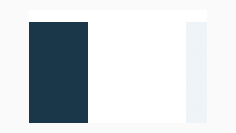
In a quick glance, without any content, you can easily figure out that in this interface lies a header, a sidebar, a main content and a decorative background. Having such an approach to design avoids losing people's attention and intuitively guides them to the main focus zone, which in our case, is this article you're reading.
Closure
The law of Closure consists in completing, closing a non-closed shape by the capacity of our brain alone. It means that whenever our eyes see an unfinished letter, picture or shape, our brain automatically perceive it as whole. Putting simply, we fill in the gaps.
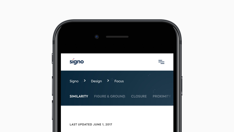
A straightforward example would be the signo navigation model used on mobile devices. In this project, sub-navigation is more consequent than top-level browsing. Instead of hiding quick-access links behind a button or a clunky interface, we designed sub-level navigations in a suggestive way. We suggest to people's mind that something is hidden behind this fading text, and that more content is available.
Our brain automatically fills the missing pieces as long as they are correctly suggested. A good recommendation would be that suggestiveness shouldn't be more than 50% of what is originally seen.
Proximity
Proximity in Gestalt psychology tells us that the physically close elements form a group for our brain. It's used for categories, image & text groups, and title & paragraphs. It is often used in association with the law of similarity.
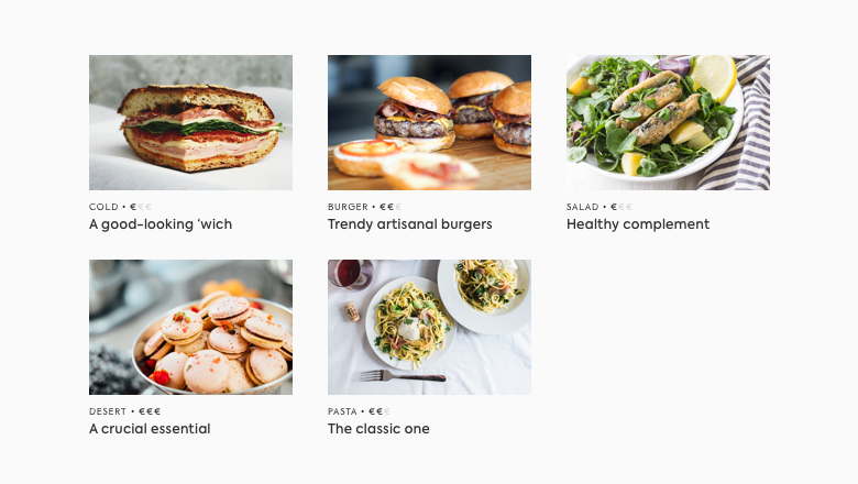
Without explicitly indicating what this example represents, unconsciously your mind already determined that each of these recipes previews are grouped together following a particular order: an illustration, a label/category, a price range and a title.
It perfectly illustrates how proximity works for associating UI elements together. Although, while grouping is recommended, it doesn't mean that white space has to suffer a decrease. On the contrary, your interface can only gain in clarity and comfort with white space. The golden subjective rule is to never use it too much so that proximity doesn't work anymore.
Be also aware of avoiding small click targets: give links some padding. Some people with motor disabilities may have difficulties hitting small targets.