Colors
Contrast ratio
Color and contrast are key elements for users to correctly see and read your content. Making sure your color palette contrast is sufficient is the first step to make sure interactive elements are visible and your content is usable. This will also be profitable to users using your project in a very bright environment.
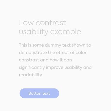
Do
These lines of text follow the color contrast ratio recommendations and are legible against their background colors.
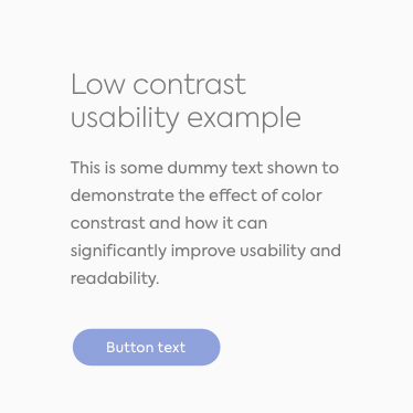
Don't
These lines of text do not follow the minimum color ratio recommendations and are much harder to read.
W3C recommendations
Color contrast is determined on a 21 ratio scale defined by the intensity of light emitted by a foreground color and its background. This contrast is usually written as 1:1, up to 21:1. The higher the difference between the two numbers, the higher the contrast is and the better the readability of text is. The World Wide Web Consortium recommends a minimum of:
- 4.5:1 ratio for small text against its background;
- at least a 3:1 ratio for larger text (14pt bold or 18pt regular).
This is for AA compliance. For more advanced compliance, AAA, your minimums are:
- 7:1 ratio for small text;
- 4.5:1 ratio for larger text.
We made it easy for you to check your contrast: simply use our in-house ratio checker.
Color blindness
There are multiple types of color blindness but it all comes down to not seeing color clearly, getting colors mixed up, or not being able to differentiate certain colors.
In a group of eight men and eight women on your team, there’s a 50% chance that at least one teammate is color-blind. While there are several different types of color blindness, all individuals who are color-blind rely on cues like shapes or semantics in situations where they could otherwise rely on clearly differentiated colors, like when waiting for a traffic light to turn "green".
You should not rely solely on colors to give information, for buttons or even color selection. Labeling elements is a key element to accessibility. But besides that, believe it or not, but designing for color-blinded people isn't much different than "regular" design.
Grasping what color-impaired people see is hard to define, and trust me, this comes from a color-blind designer. But basically it is a color shifting or harder distinction of hues. An easy design fix is to first design your artboards in black and white, namely wireframes.
Sensory information
According to different studies, we all see slightly different colors. Our eyes are not all identical. And while it might be okay for the majority of people, some people simply cannot see colors, or not how "normal people" perceive them. This is why you should not convey information strictly through color.
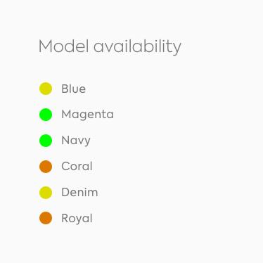
Do
These color bullets are understandable to anyone because they do not only convey sensory information.
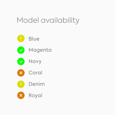
Don't
These color bullets can be mixed or not be understood because the information is only conveyed by color.
Never forget to use visual cues to enhance your design for visually-impaired people.