Writing
Typography
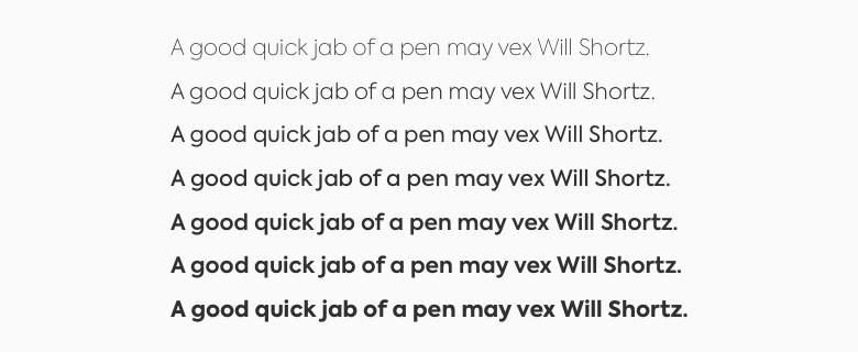
Typography is essential to a good design. The first step to make an accessible choice is, of course, choosing a legible typeface. Sans-serif fonts are proven to be more legible because the level of detailing serifs offer can cause trouble for certain visually-impaired people.
Proportions
Another important factor resides in the visual aspect of your font. Proportions are crucial for legibility, and you should prefer fonts with characters that are easily identifiable. The X-height of a font, which represents the distance between the baseline and the midline of lower-case letters — typically a x, is also what makes it a legible font.

Weight
Font weights vary between Ultra Light and Ultra Black, but not all fonts include each set of weight. Standardized values defined by the W3C exist between 100 and 900. The key to balance weight and legibility is to avoid characters which become too thin for the eye. A good exercise for trying out your font weight is squinting your eyes to check if you can still see.

Line height
This is another essential. Mastering line height will not only make your text legible, but also readable, because of the increased visual comfort and appeal. Headings and copy require different values:
- depending on your font, for text copy, we recommend a line height value between
125%and150%; - headings require lower values because of increased font size, so as low as
100%.
Text size
It's a no-brainer, of course. Text size is really important for both legibility and readability. For general paragraph text, we recommend sticking to 1em, which is the default web sizing, equivalent to
16px.
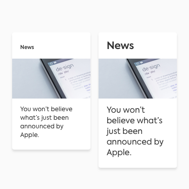
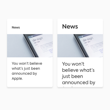
Further than setting text size, while designing your UX and integrating it, you should think about text sizing defined by the user. Zoomed text up to 200% should still be able to fit your interface without information truncating.

Do
These cards follow the content based on the zoom imposed by the user and information is still complete.

Don't
These cards don't take in consideration the browser zoom and the displayed text is only partial.
Tone of voice
While writing for accessibility-friendly content, keep in mind the audience you are addressing to. A few on-the-go tips would be:
- be precise and concise;
- avoid directional language like "Select options in the sidebar" but "Select from these options" instead;
- use information hierarchy, with headers like
h1for top-level, going down withh2andh3, and so on; - keep it simple;
- use meaningful link text, unlike "click here";
- think of descriptive image alternatives.